| Category | Branding | Skills | Strategy, Packaging, Sub-Brand Development
| Tools Used | Illustrator, Photoshop, Miro
| Tools Used | Illustrator, Photoshop, Miro
OVERVIEW: A concept project exploring what a new product line extension could look like for The PÜR Company, a Canadian brand known for its aspartame-free gum, mints, and popcorn. The brief was open: design packaging for a new PÜR popsicle line, choosing flavours, package format, and visual direction while ensuring the result felt unmistakably PÜR.
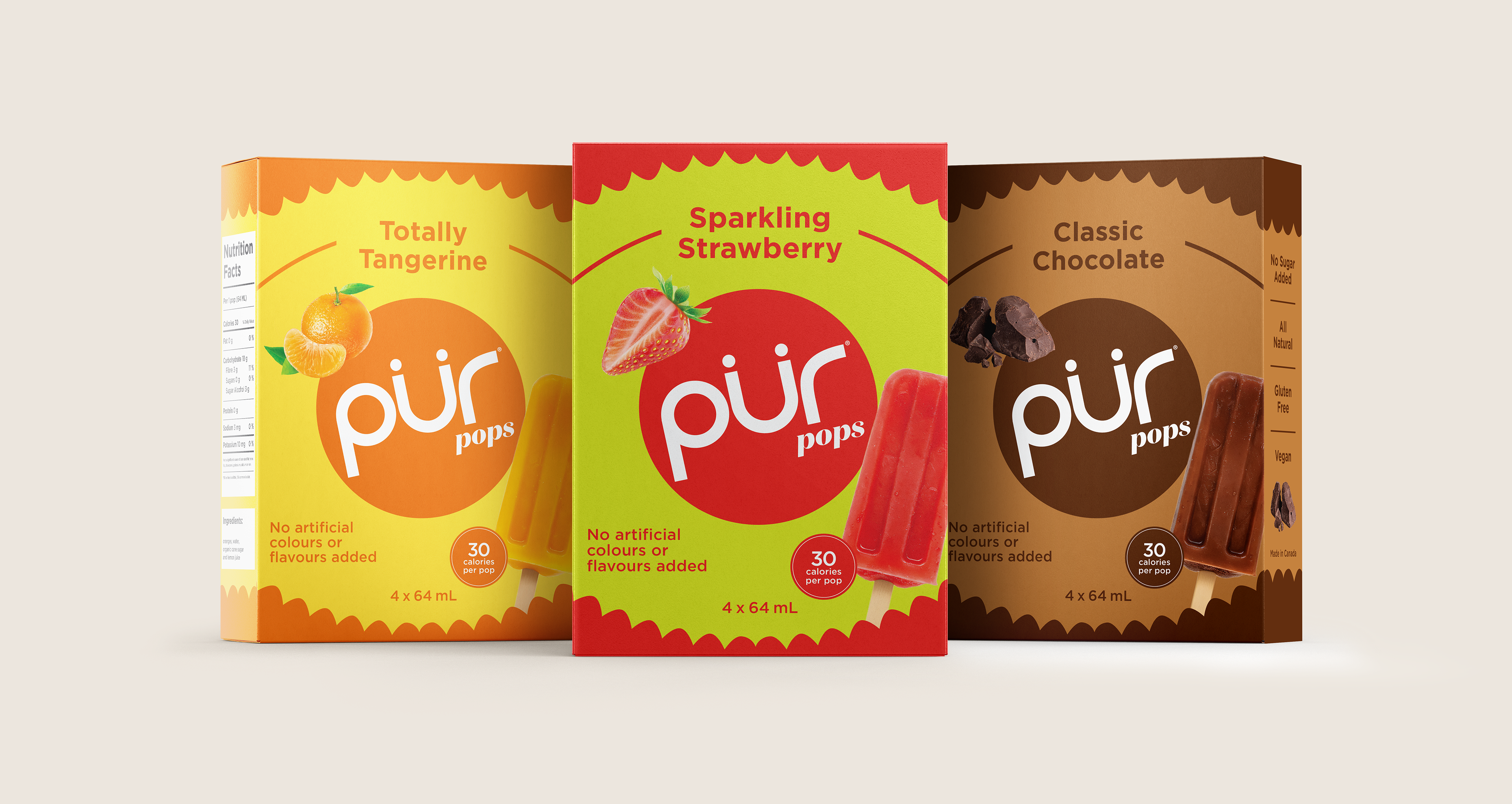
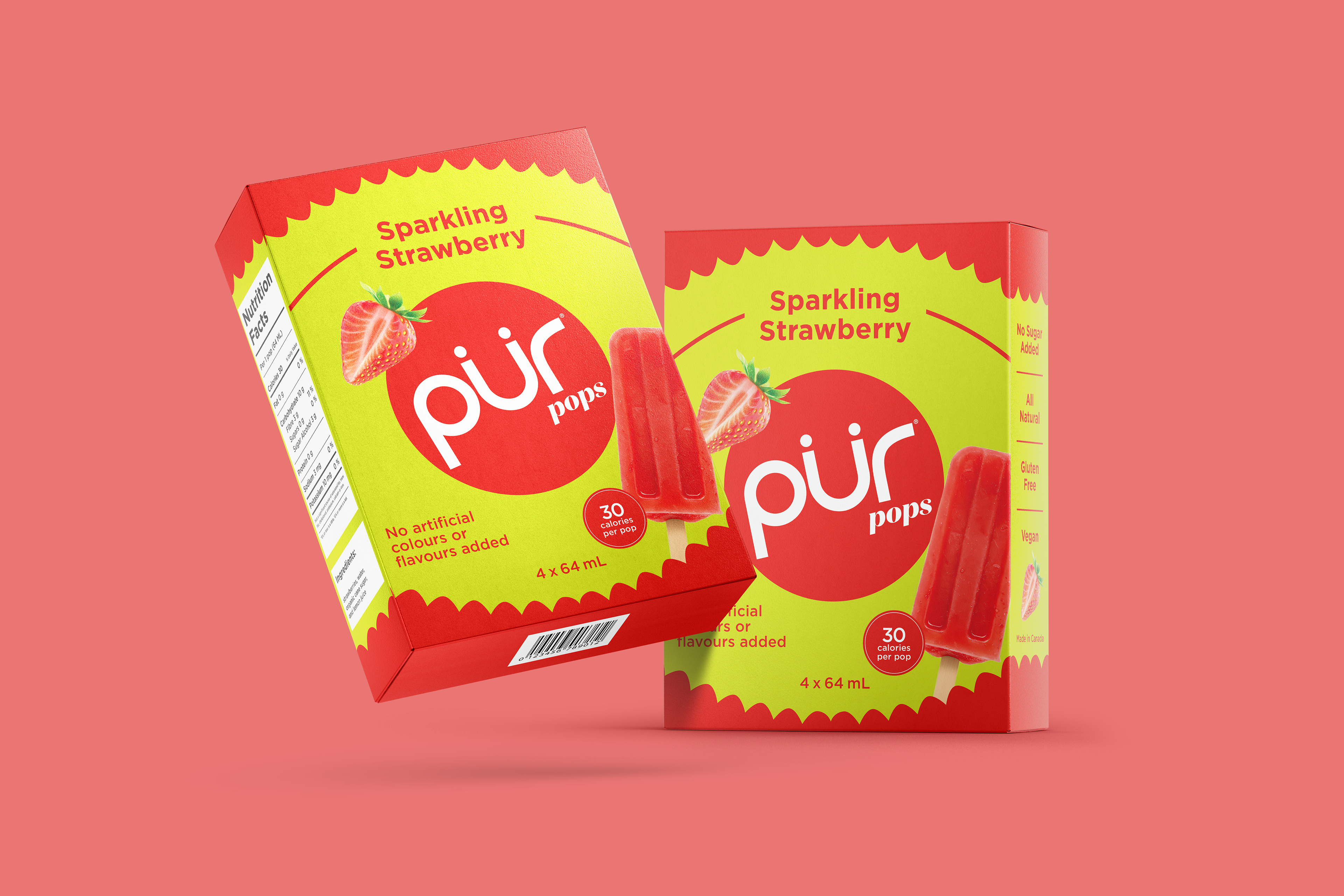
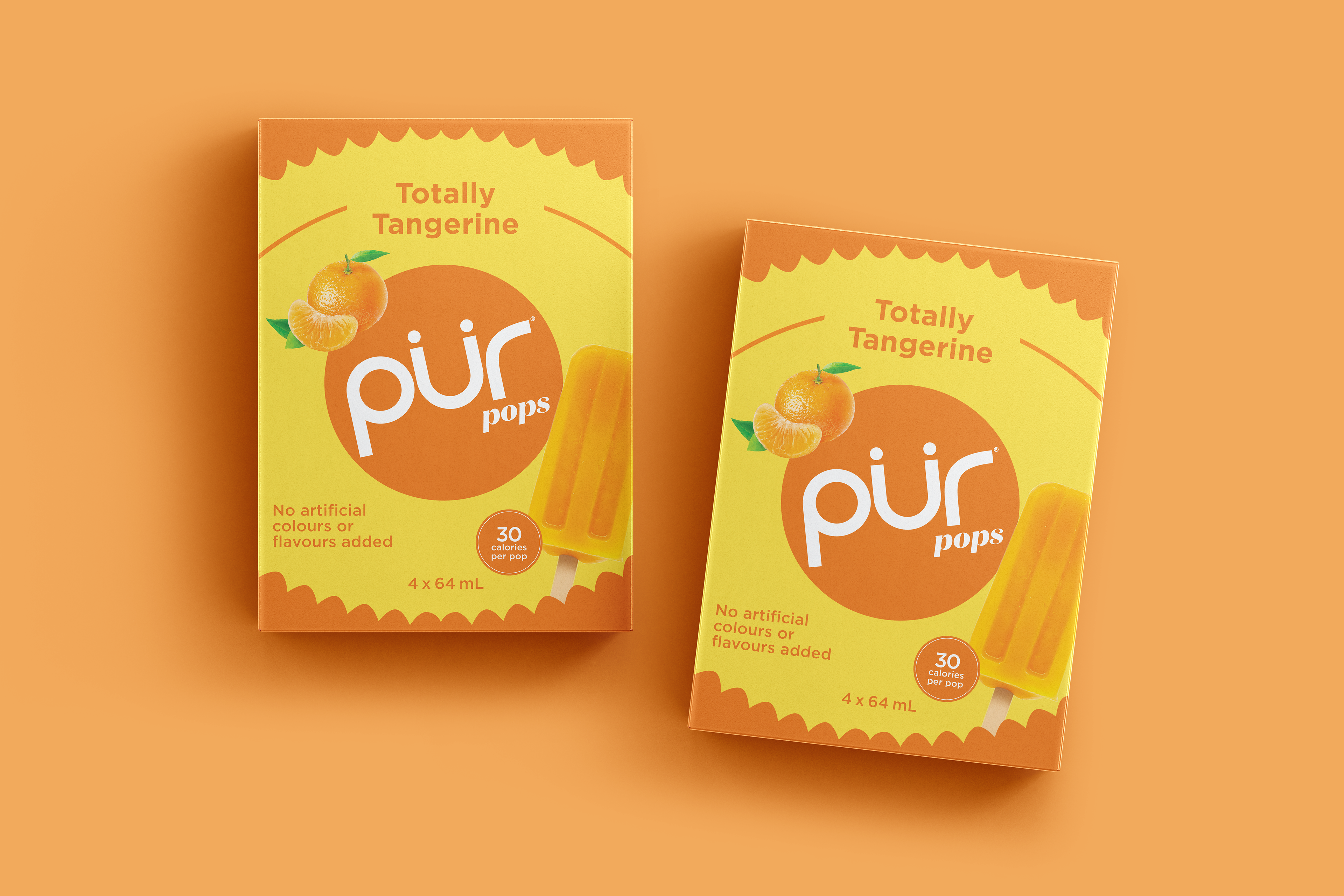
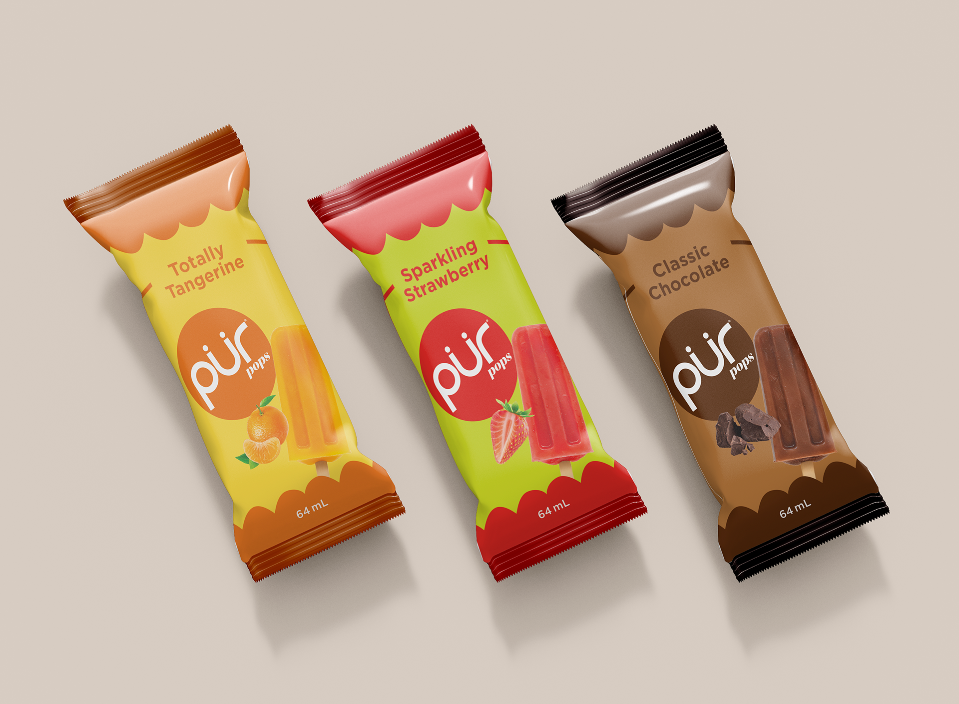
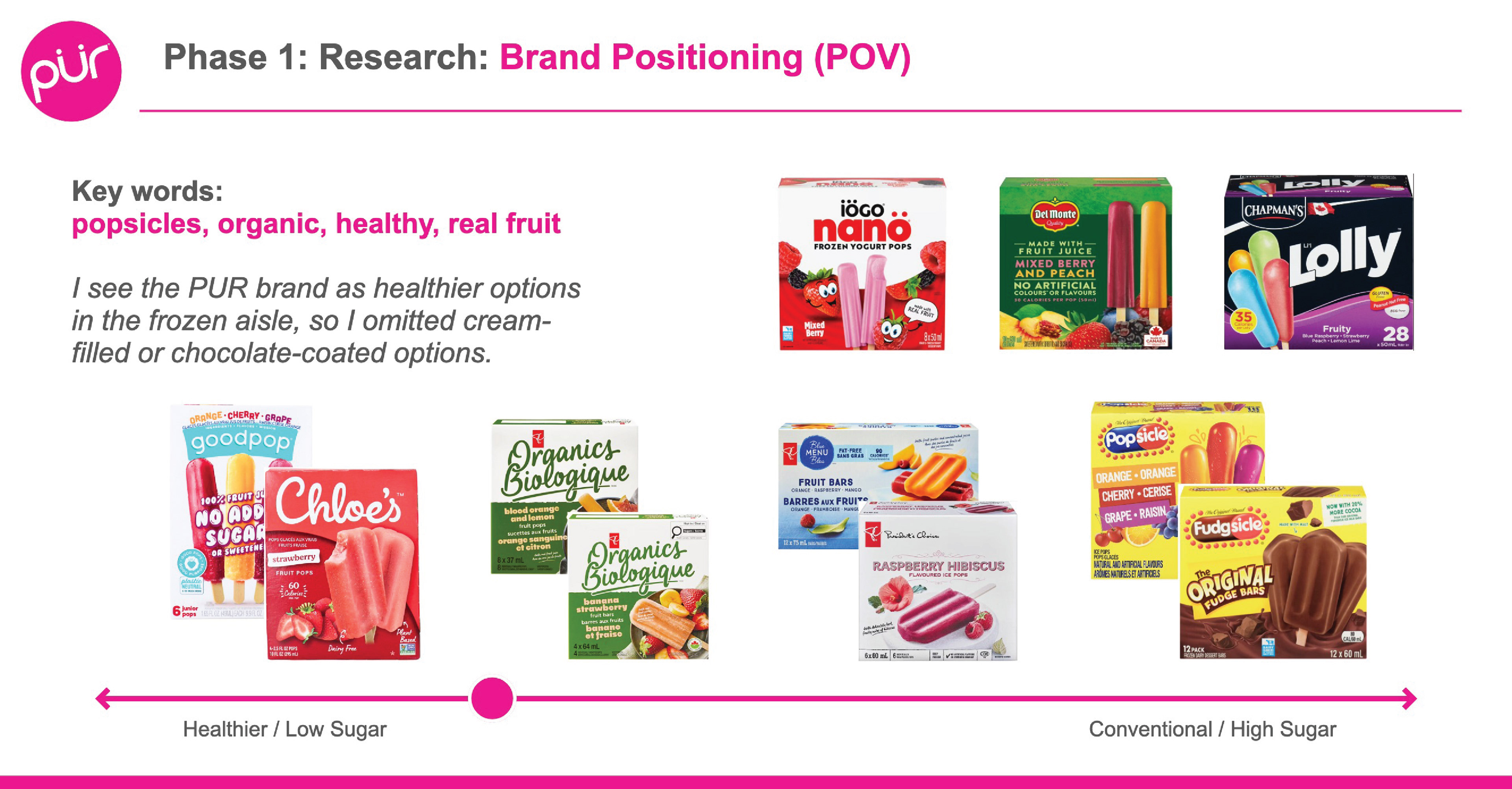
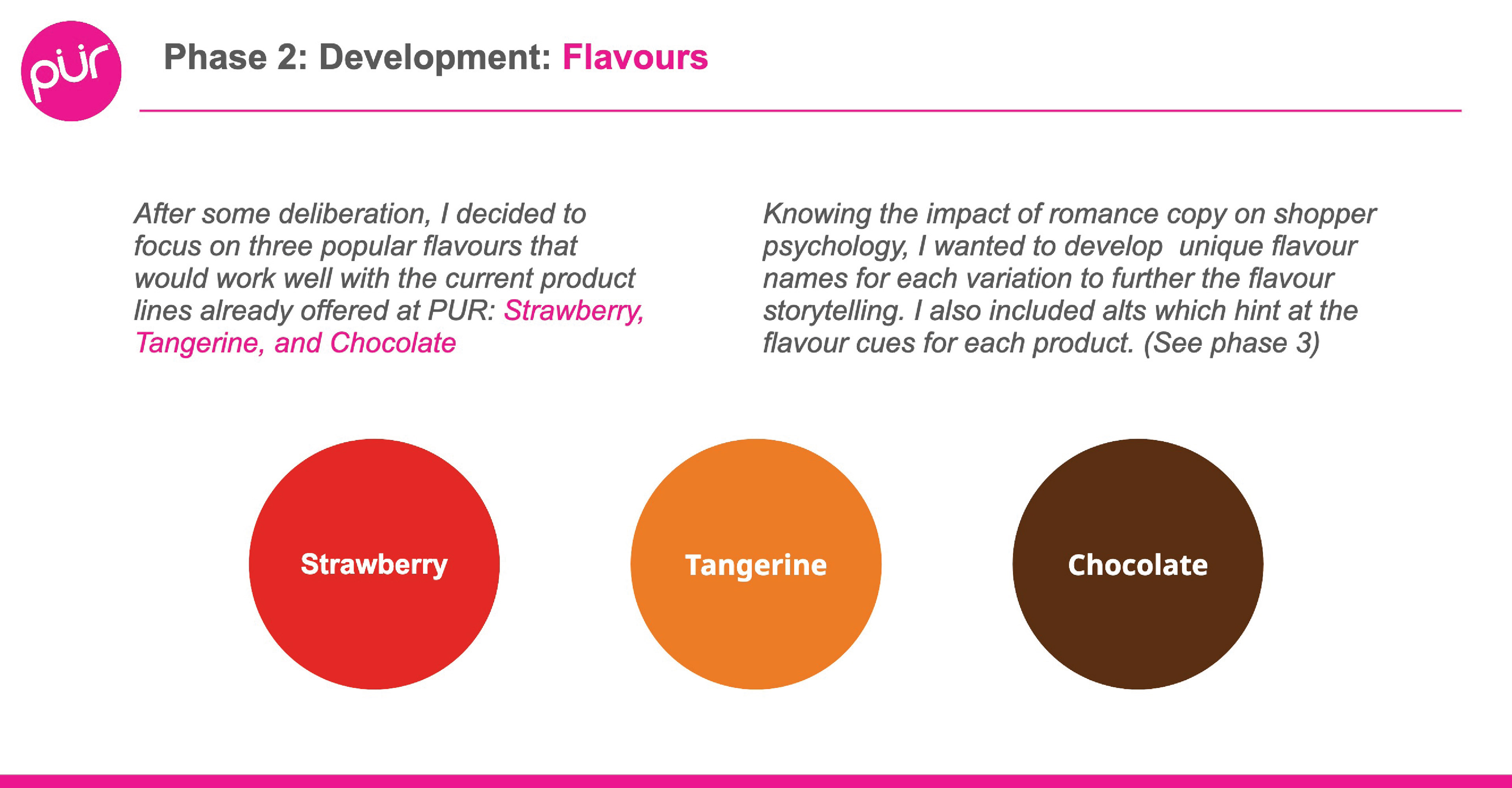
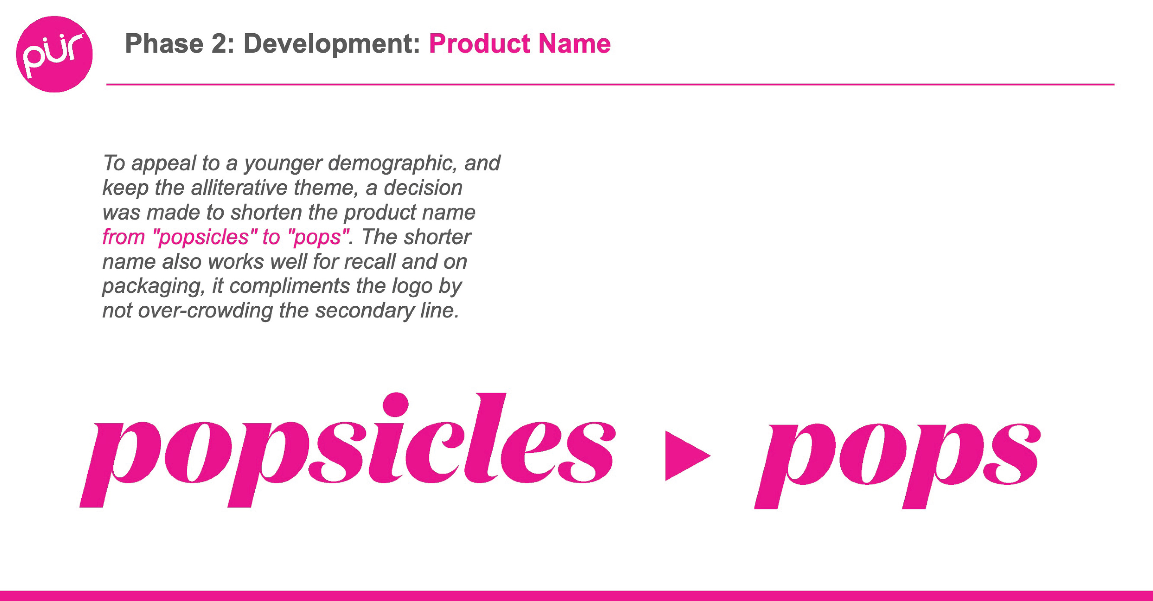
The process began with competitive research and brand positioning, mapping the frozen aisle landscape from healthier, low-sugar options through to conventional products, and identifying where PÜR would credibly sit. From there, three flavours were developed: Sparkling Strawberry, Totally Tangerine, and Classic Chocolate. Each given a distinct alliterative name informed by shopper psychology and flavour storytelling, with options developed alongside each one.
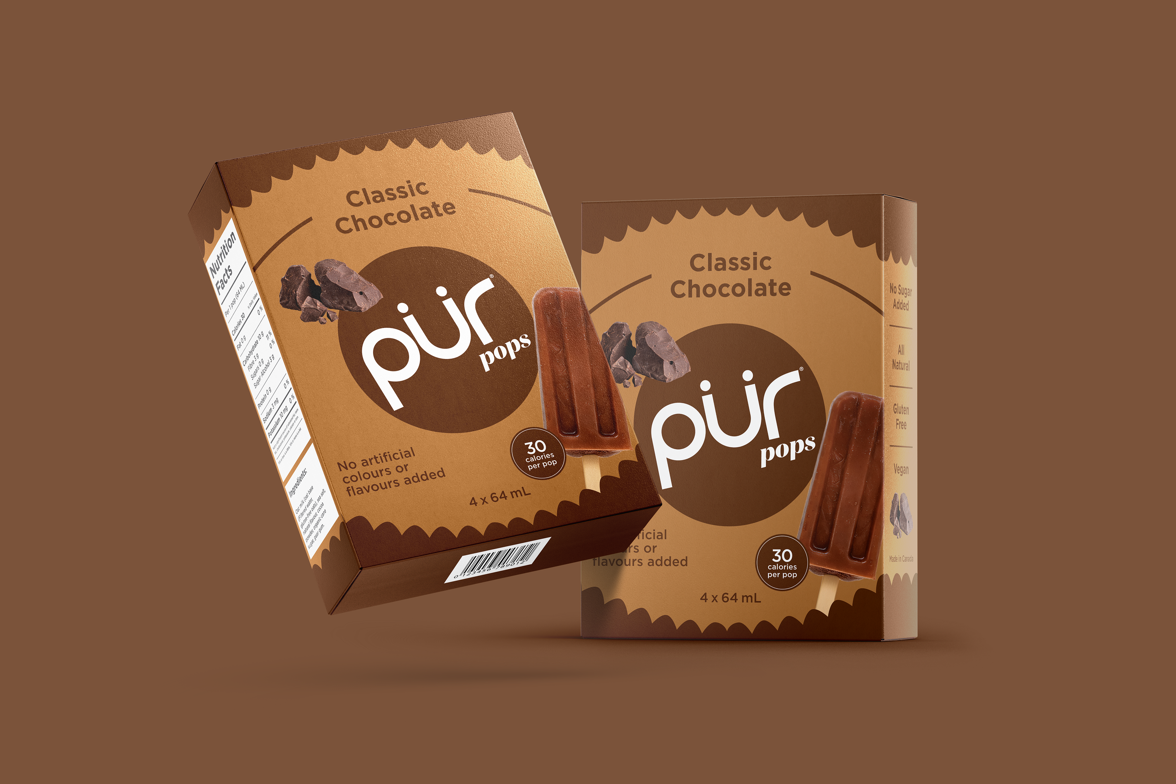
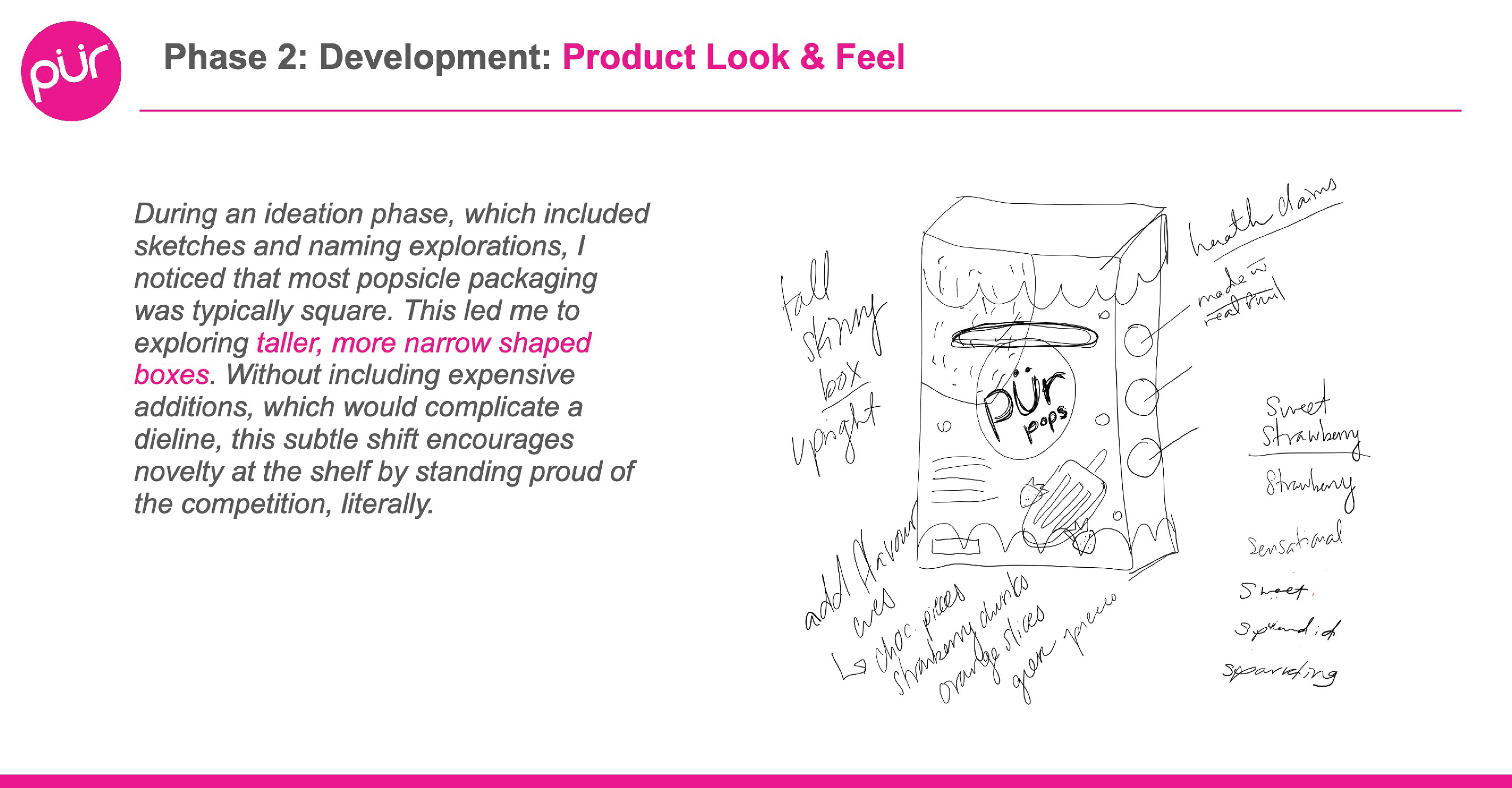
On the structural side, research showed that most popsicle packaging defaults to a square box format. A deliberate decision was made to design a taller, narrower box, a subtle shift that creates shelf standout without adding production complexity or die line complications. The format also informed a bonus single-serve wrapper format, extending the system across two packaging types.
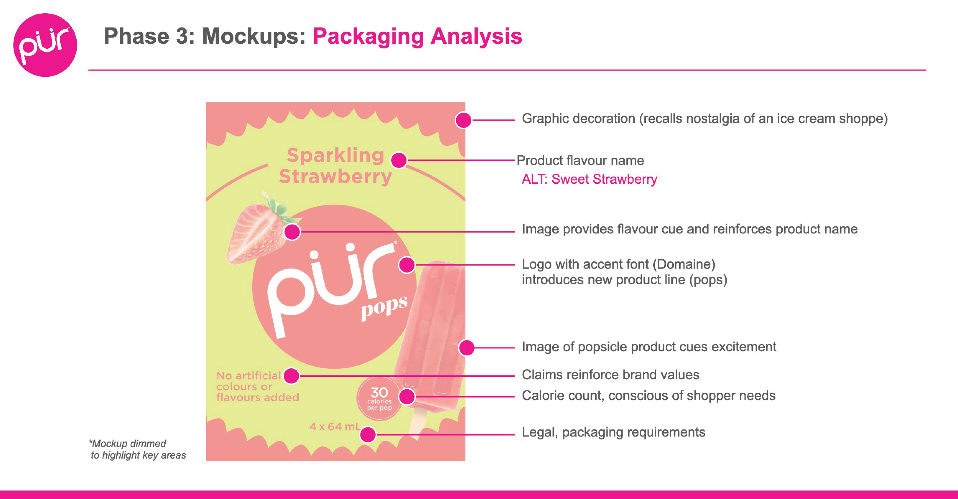
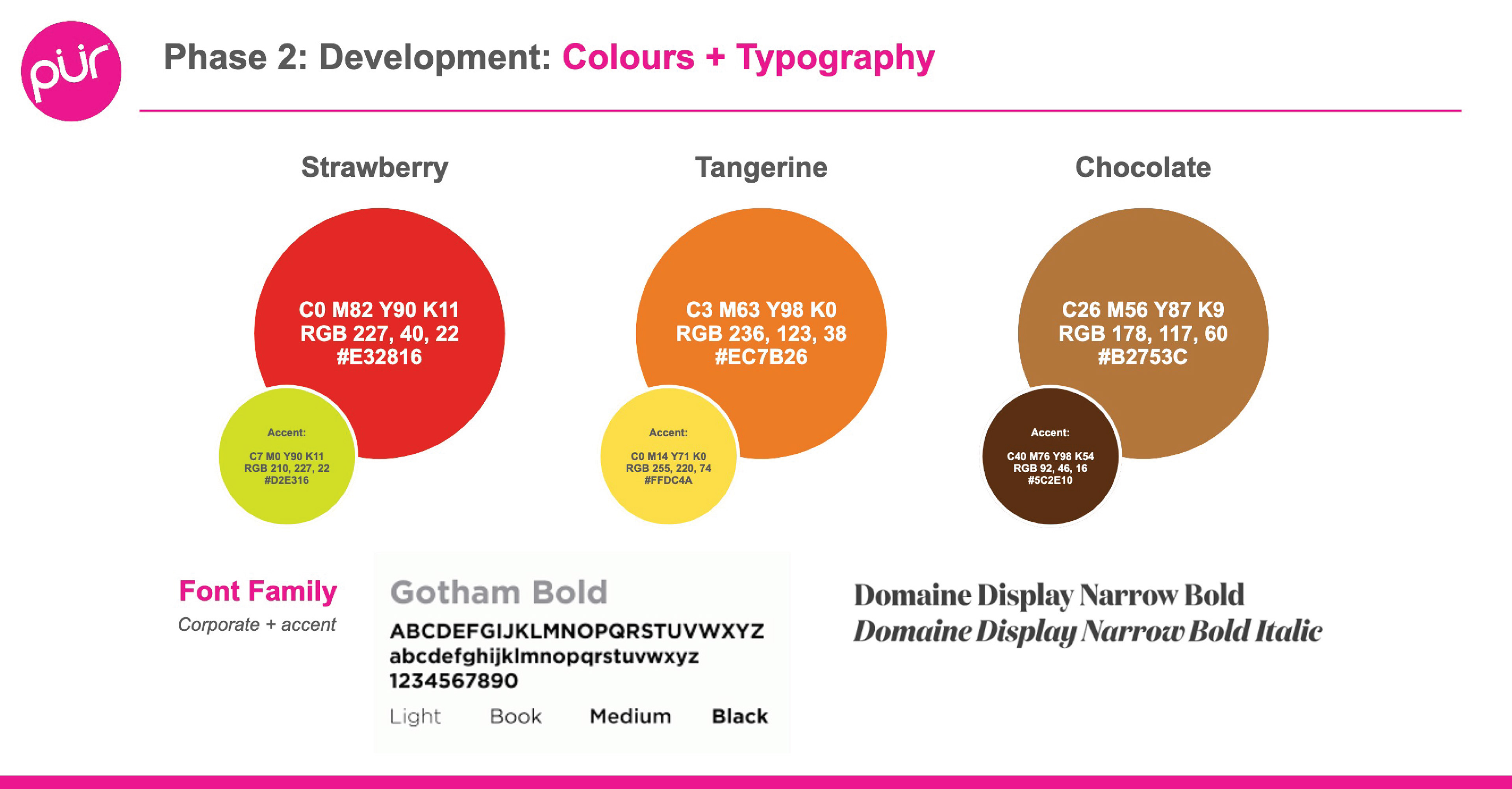
For the sub-brand identity, Domaine Display Bold was selected as the accent typeface for "pops", chosen for its weight and curves, which nod to the retro nostalgia of a 60s ice cream shoppe while remaining contemporary enough for a health-conscious shopper. Each flavour received its own colour system, developed with both primary and accent values, applied consistently across all faces of the box including nutrition facts, brand claims, and legal copy.
The final deliverable was a fully resolved, three-flavour packaging system presented across box and single-serve formats, with a complete rationale covering research, naming, structure, identity, and colour.
Strategy Presentation
Final Packaging Mockups