Environmental graphic design is the graphic communication of information in the built environment. This can be seen through directories, banner designs, pedestrian directionals and street signage. As the built environment grows more complex, the need for visual information to better navigate our surroundings increases.
Creating a sense of place in Curitiba was a challenge. In a city with a population of nearly two million people in 2010, the goal to rebrand the city and its parks was daunting. One strategy in particular—communicating meaningful information through key words, symbols and diagrams—was extremely useful. In Curitiba, the priority of people over vehicles means mobility, sustainability and identity are paramount; and in a city that sees more than two million tourists every year, there is a growing need for easily understood signage.
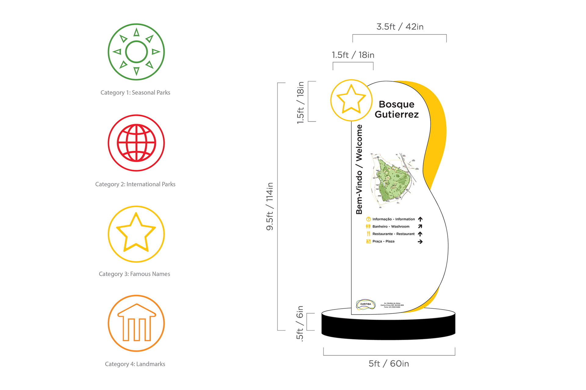
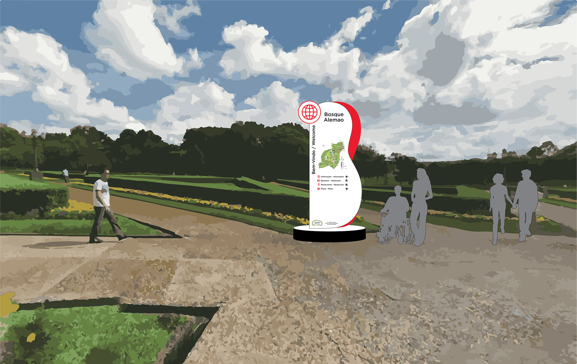
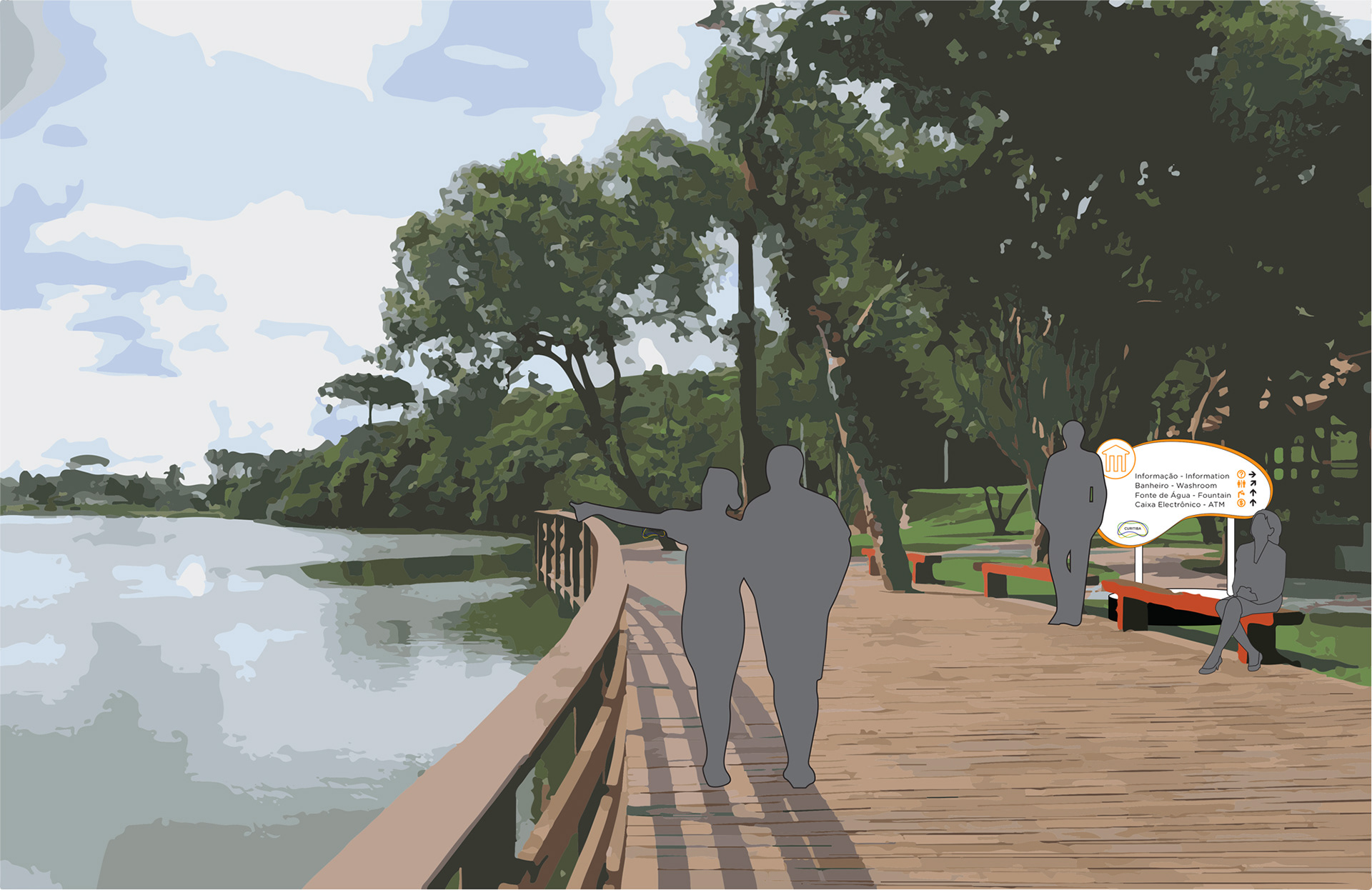
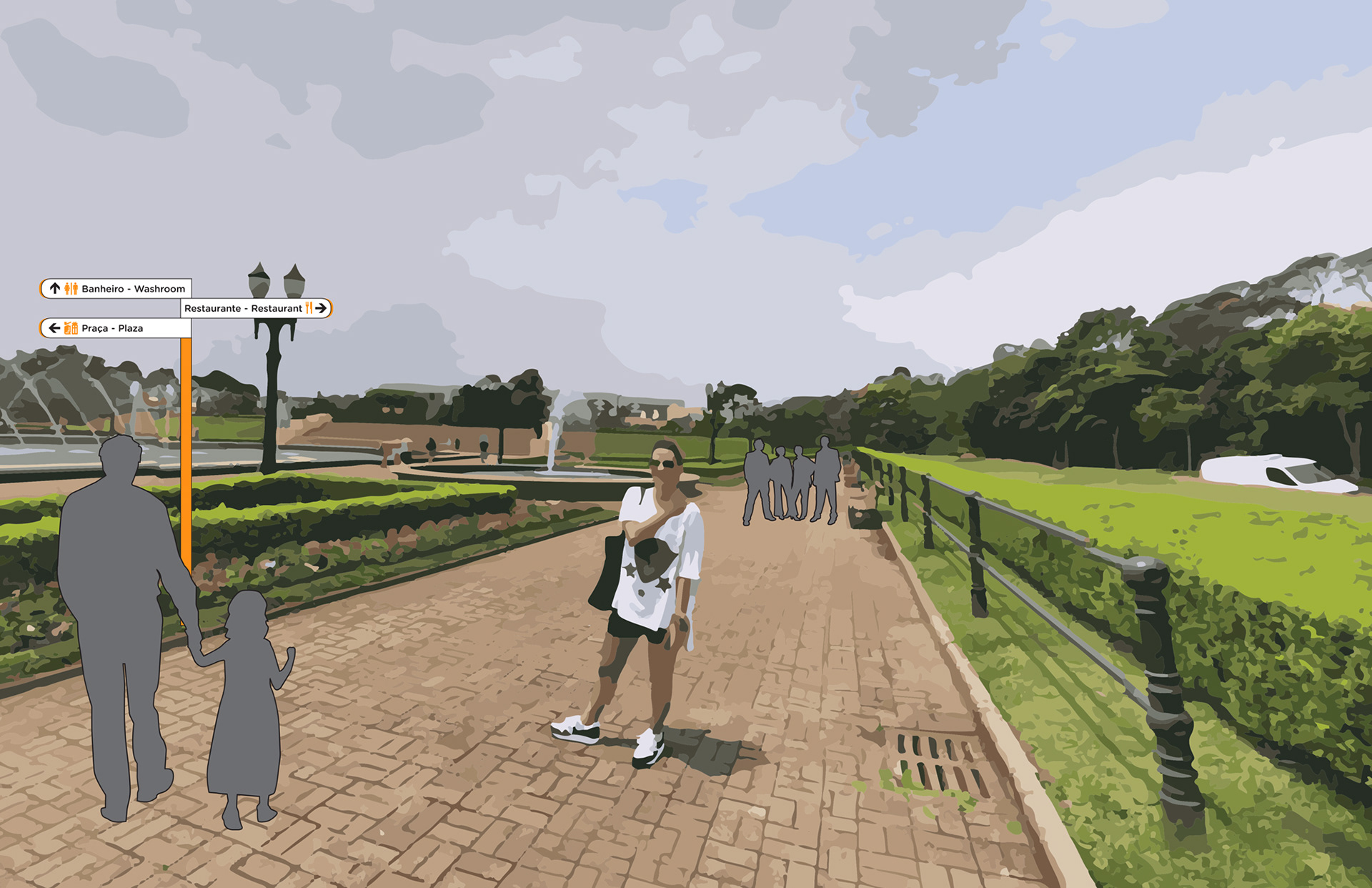
Keeping the above in mind, the final system showcased bright and colorful signs and directionals with native Portuguese and secondary English phrases. The parks were divided into four distinct categories: Seasonal, International, Famous Names and Landmarks; and are distinguished by color and their corresponding icons.
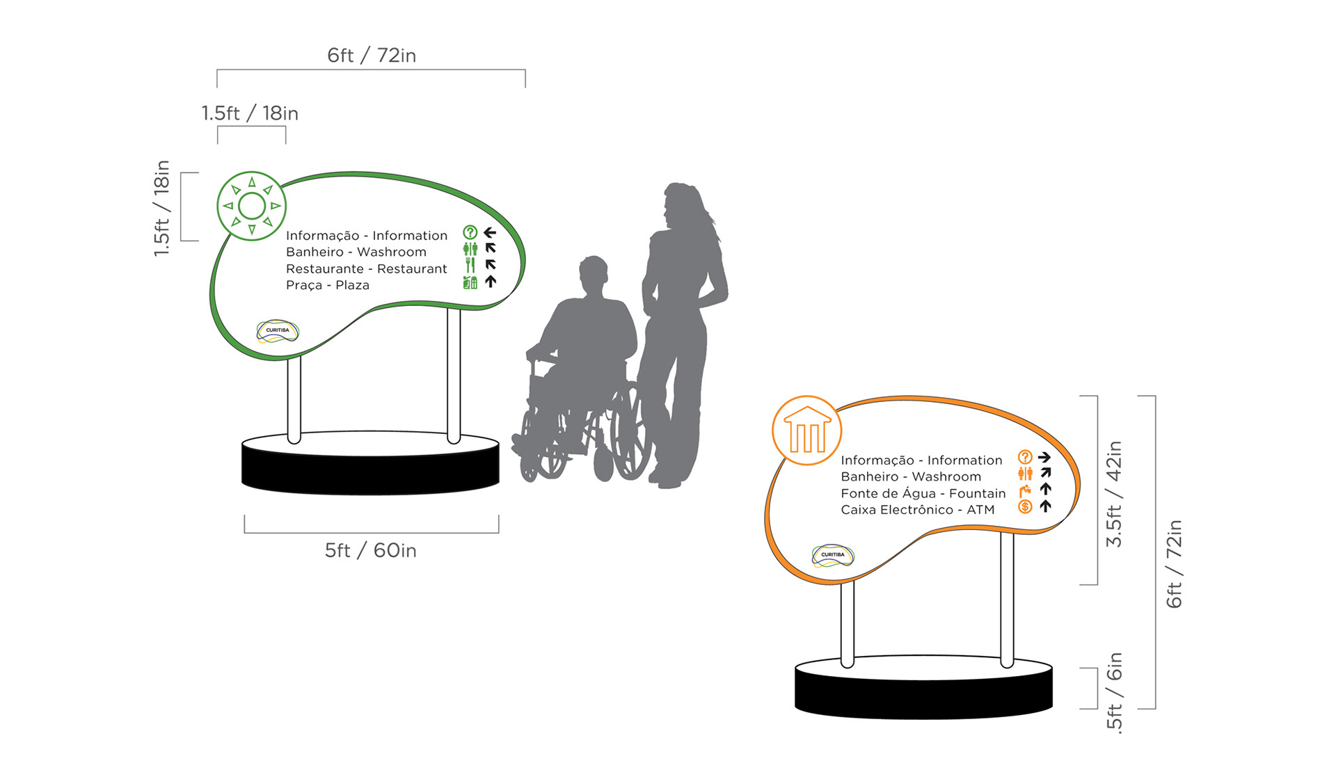
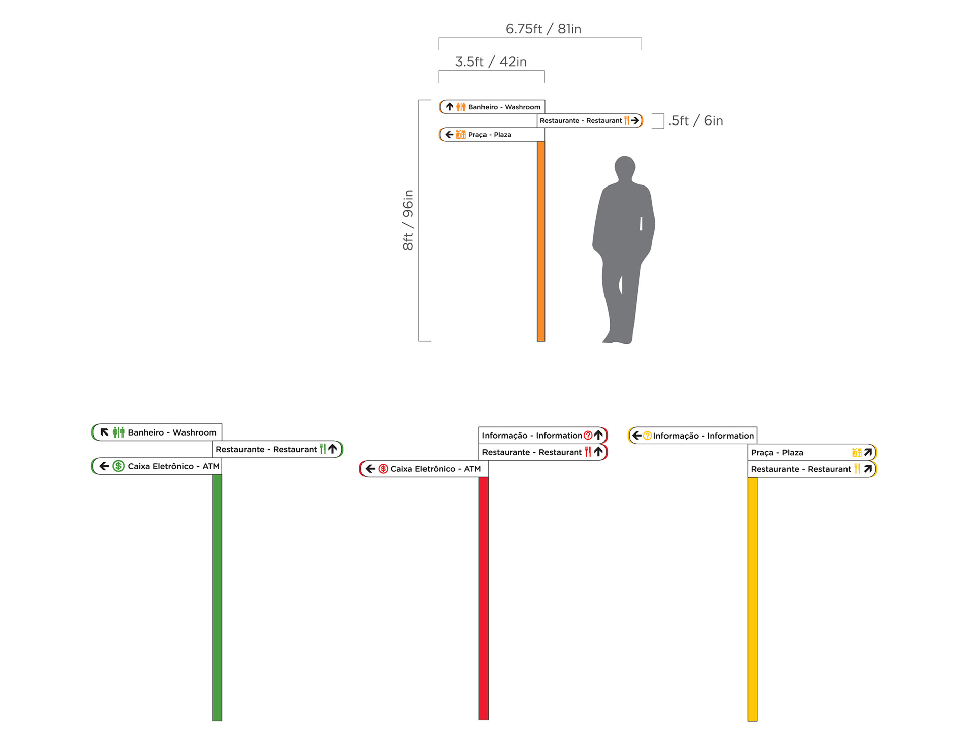
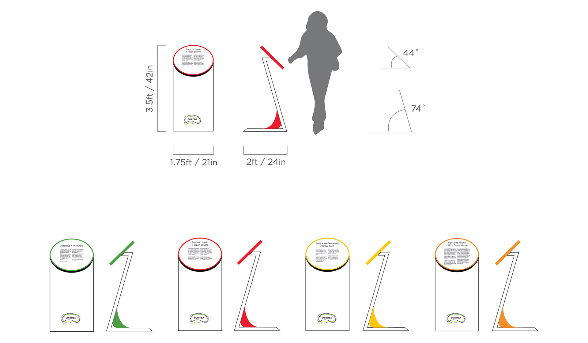
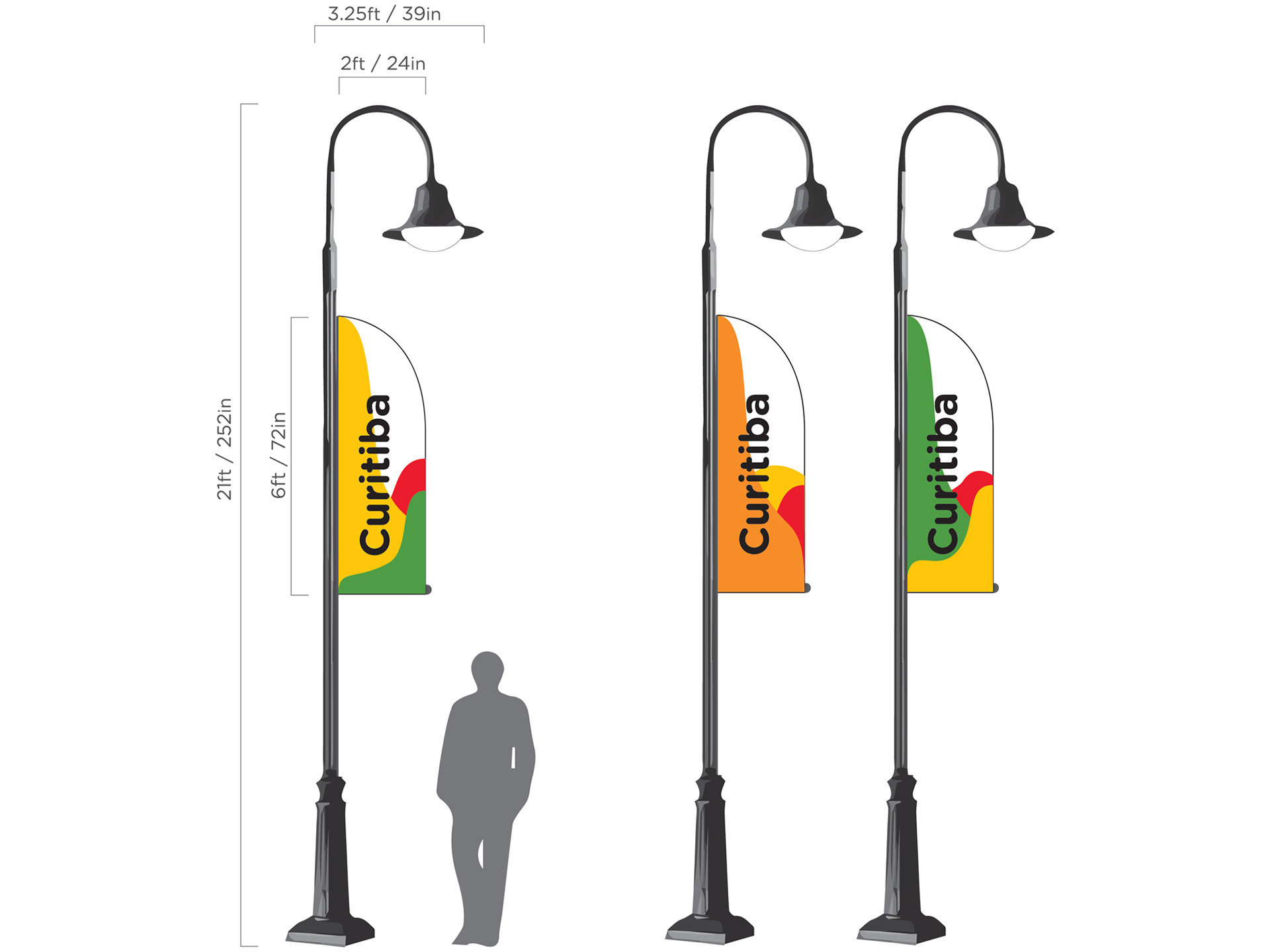
Aside from the lamp post signage which is constructed from waterproof vinyl, the park signs are all made from a coated anodized aluminum. Both the park entrance and pedestrian directionals feature light emitting diodes which illuminate the park icons after sunset. All bases shown are made from cement and any instances of color are treated porcelain enamel.
Mindful of Brazilian culture and habitat, the materials chosen for construction
are able to withstand heavy foot traffic and quickly changing weather conditions.
They are also resistant to most graffiti and can be easily cleaned, if necessary.
are able to withstand heavy foot traffic and quickly changing weather conditions.
They are also resistant to most graffiti and can be easily cleaned, if necessary.