OVERVIEW: Over the years, I’ve partnered with a range of clients to develop impactful branding solutions, ranging from subtle refreshes to comprehensive identity systems built for both print and digital applications. My approach begins with understanding the core motivation behind the re-brand, ensuring the final outcome reflects the client’s vision while resonating meaningfully with their audience. Whether designing for an individual or a larger organization, each project is guided by strategy, clarity, and a commitment to building lasting visual narratives.
The following work demonstrates the strategy and design thinking applied to developing memorable brand assets across a diverse range of industries; including manufacturing, food-service, fashion, and health and wellness. Each project begins with a thorough research phase, providing a strong foundation for the branding process. From initial concept to final asset delivery, clients are engaged in a collaborative process that ensures the outcome not only aligns with their vision but also resonates with their audience and supports long-term brand growth.
| Category | Branding | Skills | Strategy, Communication, Research
| Tools Used | Illustrator, InDesign, Photoshop
| Tools Used | Illustrator, InDesign, Photoshop
Tarrison Products Ltd.
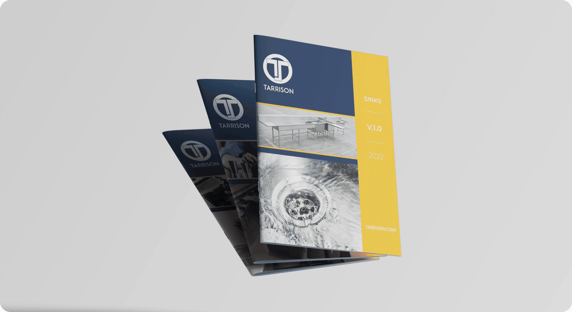
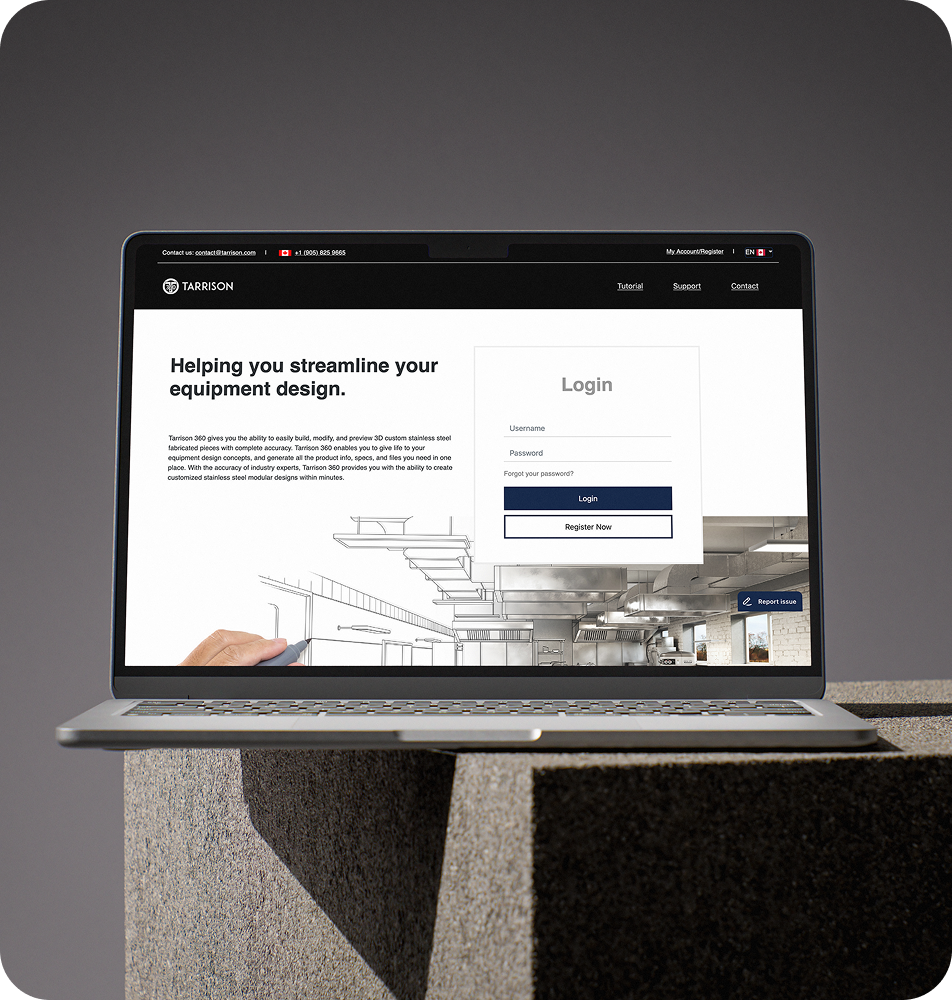
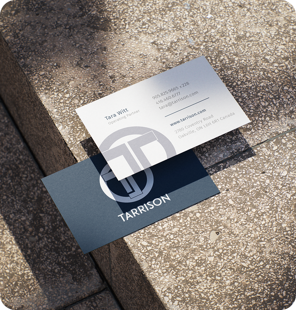
THE CLIENT: Tarrison is a full-line manufacturer specializing in modular stainless steel products designed for storage, service, and display across a variety of industries. With a focus on durability and adaptability, Tarrison offers customizable solutions including Smart Servery Systems, food-service equipment, storage and handling products, and outdoor kitchens. Backed by a dedicated fabrication shop and distribution centers in Canada and the U.S., Tarrison is committed to delivering high-quality products quickly and accurately, while providing reliable service and support to its customers.
THE INSIGHT: Working closely with operating partner Tara Witt, the Tarrison brand refresh evolved over several years, beginning with a subtle update to the company’s primary logo and the introduction of the Tarrison 360 identity. These foundational changes were first applied to business cards, establishing a refreshed visual language. The project later expanded into a more significant overhaul of the brand’s product catalogues, aligning them with the updated identity and ensuring consistency across all customer-facing materials.
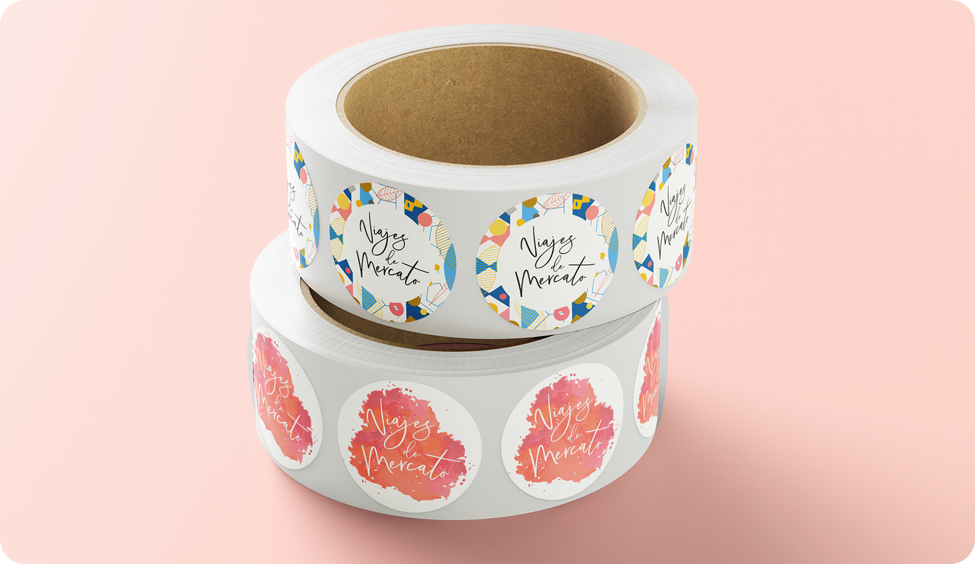
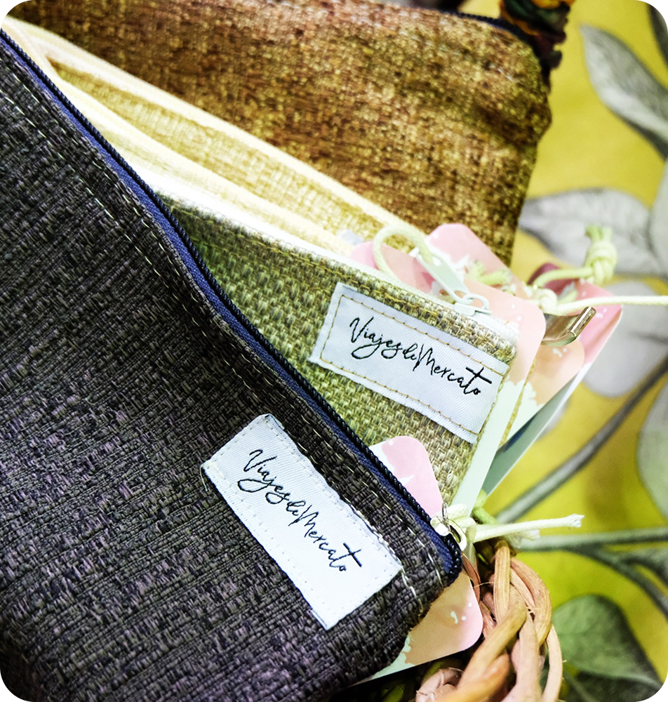
Viajes De Mercato
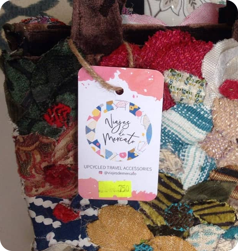
THE CLIENT: Viajes de Mercato is a family-owned retail company based in Baguio City, Philippines, specializing in up-cycled travel accessories that are handmade and locally designed. The products are sourced through its sister company, Telas de Mercato, reinforcing a shared commitment to sustainability, craftsmanship, and community-driven production.
THE INSIGHT: At the heart of the Viajes de Mercato re-brand was a desire to honour the rich heritage of the Filipino textile industry, the founders’ indigenous roots, and their sustainable commitment to the local environment. The new identity was designed to reflect these core values; merging cultural history with a modern visual language that reinforces the brand’s authenticity and purpose. During a scope change, two simplified versions were included to accommodate a secondary request.
The updated logo now reflects the company more holistically and has been used across their website, social media accounts, at trade shows and of course, to reinforce brand recognition across their various product lines.
Il Mercante Inc.
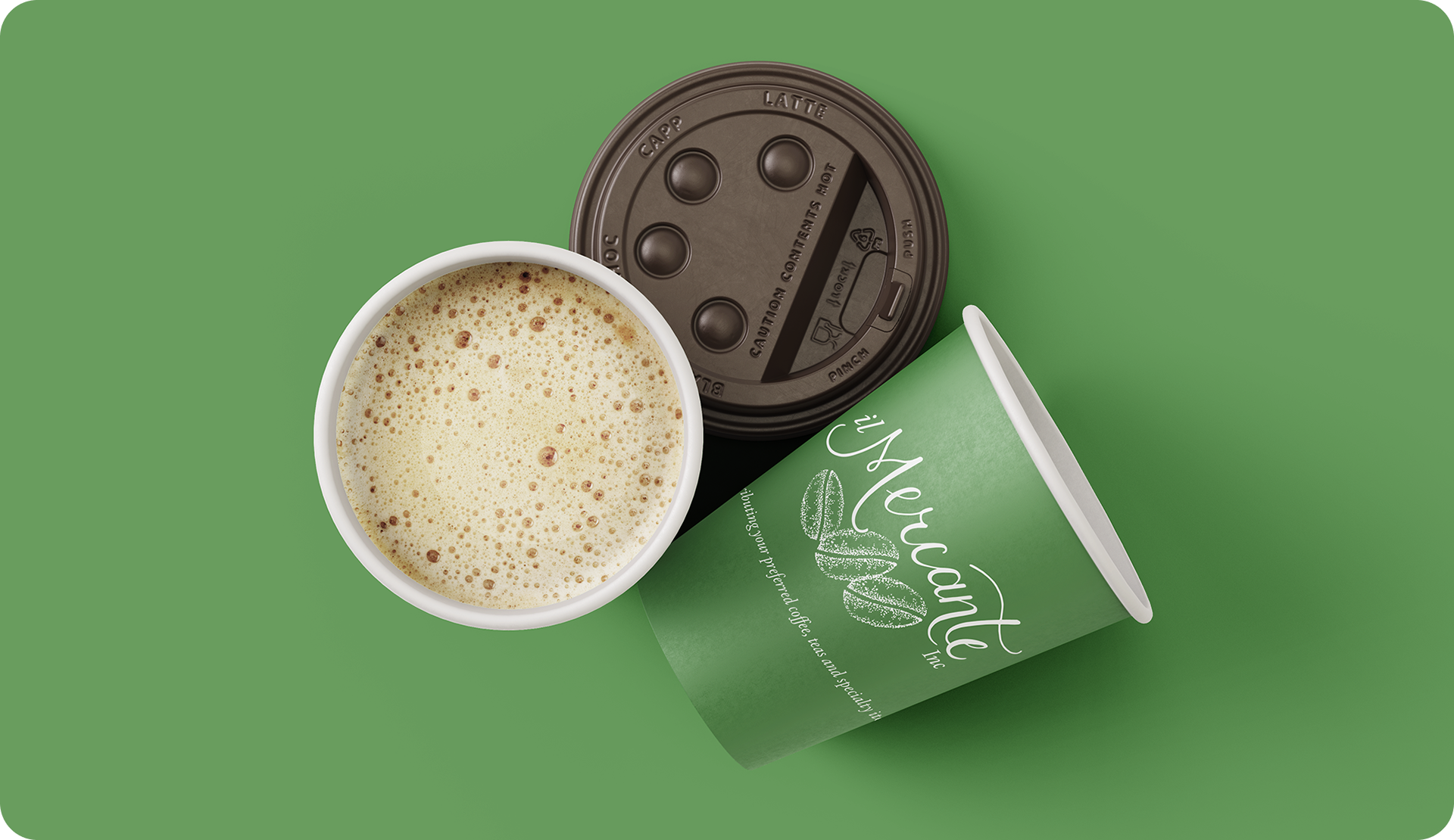
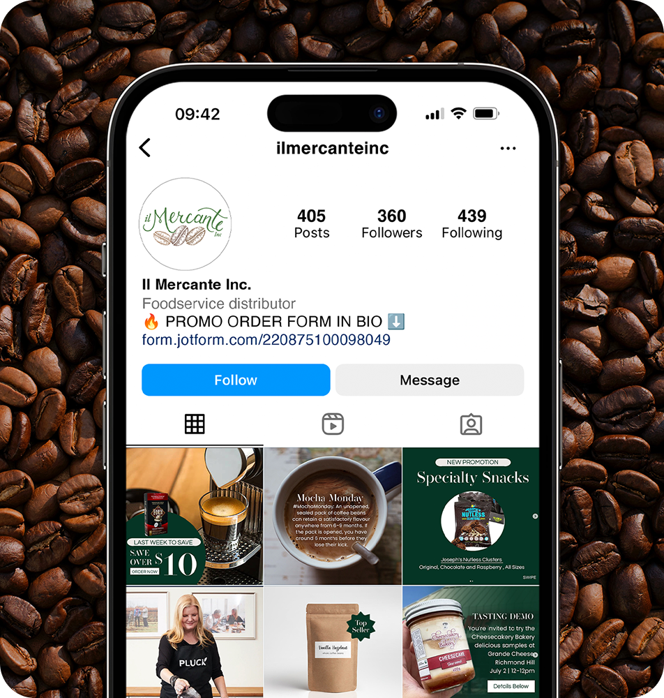
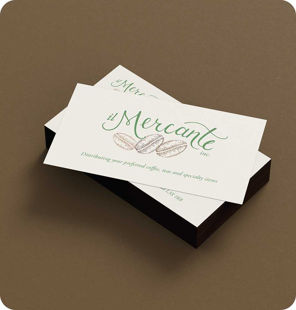
THE CLIENT: Founded in 1995, Il Mercante Inc. is a Toronto-based business specializing in the sourcing and distribution of premium gourmet coffees, specialty teas, and curated food items. With over 30 years of industry experience, the company has earned a trusted reputation among hospitality, retail, and corporate clients by delivering high-quality products and tailored service solutions.
Il Mercante’s offerings include a diverse selection of coffees, coffee equipment, specialty tea brands, imported and local gourmet foods, unique desserts, and snacks. The company also provides expertise in coffee equipment setup and usage, helping clients create seamless, professional beverage service experiences.
THE INSIGHT: As the company approached its 20th anniversary, I was engaged to design an updated brand identity that would highlight its roots in the coffee industry. The refreshed visual system was applied across multiple channels, including social media, trade show marketing collateral, and branded merchandise.
The relaxed, approachable script is a refined adaptation of the founder’s own handwriting, adding a personal and authentic touch to the brand. The accompanying coffee beans, illustrated in a pointillism style, lend texture and depth to the final logo, reinforcing the handcrafted quality of the brand’s identity.
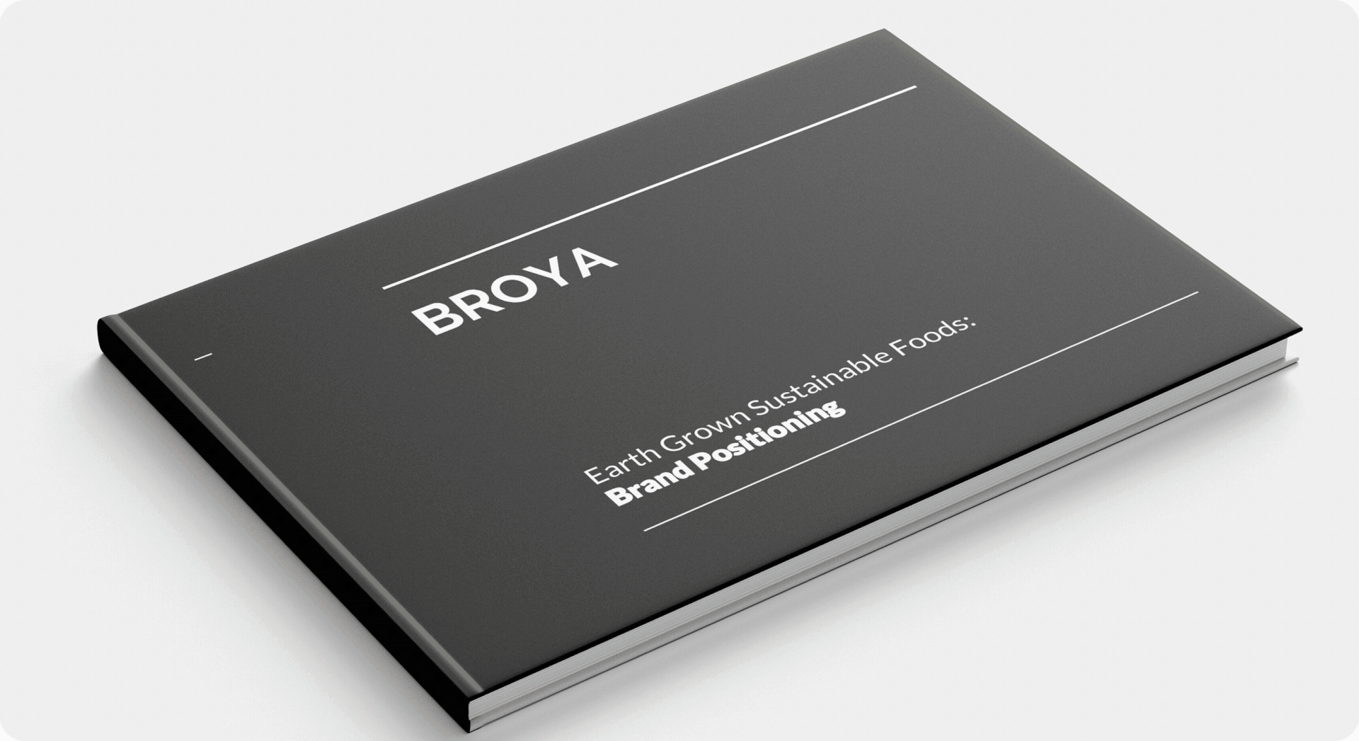
Broya Living
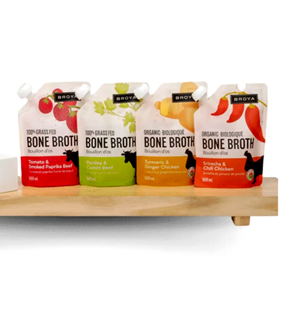
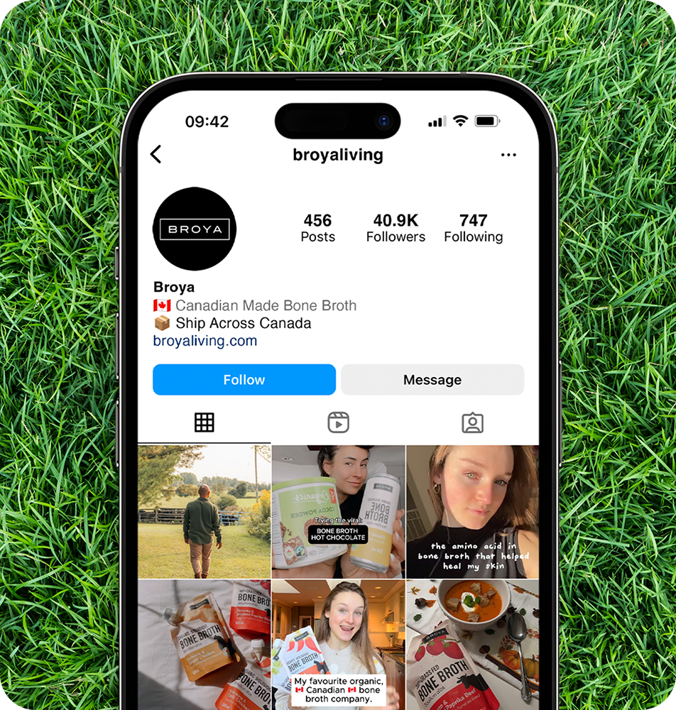
THE CLIENT: Broya Living is a Toronto-based Canadian company specializing in premium bone broth made from organic, ethically sourced ingredients. Founded by Nima Sotoadeh, the brand partners with small Canadian farms to ensure the quality, traceability, and sustainability of its products. More than a food company, Broya is committed to building strong relationships with its suppliers and customers, reflecting its mission to make wellness a meaningful part of everyday life through nutritious, great-tasting products.
THE INSIGHT: While supporting the client’s social media marketing strategy, a revised presentation guide was developed to improve clarity and strengthen brand alignment. The previous version lacked readability, prompting a shift toward a visually driven format that emphasized rich colour, simplified language, minimalist typography, and a strategic use of negative space. The result was a clear, cohesive, and visually engaging document that effectively communicated key insights and was well-received by company stakeholders.